Colour Schemes
Successful colors schemes are chosen to support the goals of a project. These goals might be to strengthen branding, increase sales, grab attention, or maintain readership. An intelligent color scheme not only looks good, but also creates a feeling in the audience. Before you pick a colour scheme, decide what type of feeling you wish to create - sophisticated, playful, vibrant, formal, informal, etc. - and with that feeling in mind, you can then go on to choose a scheme.
While there is more to be considered than making an attractive site, knowing how to create a harmonious color scheme is a strong start.
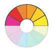
You can use the colour wheel to choose colours for your design. Usually you pick a main colour and one, two, or three accent colours. These can be pure hues, or you can choose from the tints, tones, and shades. Often a scheme works best when you use contrast in your colour choice; for instance, choosing a fully saturated red and a fully saturated blue is usually a bad choice. However, if you tone, tint or shade down one or both of the hues, then you have something to work with. Calm and soothing effects can be created when the hues you choose have very little contrast; but you must always be aware of legibility and readability.
Keep in mind that if you pick a scheme that has three colours, you don't necessarily have to use all three colours.
|
Scheme |
Definition | Examples | |
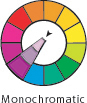 |
A scheme in which similar colours (‘mono’ means same, ‘chromatic’ means colour) are used together. Usually tints, shades or tones of the same colour - ie, add black and/or white to the core hue to get your scheme.
|
||
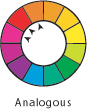 |
Three or four colours that lie directly next to each other on the colour wheel. These work because they have common primary colours. The colours are usually neighbours on the colour wheel, which makes the whole scheme quiet.
|
||
|
|
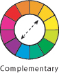
Two colours that lie directly across the colour wheel from each other. Also called Opposites.
|
||
|
|
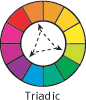
Three colours equidistant from one another on the colour wheel. The primary colours are triadic; so are the secondary colours.
|
||
|
|
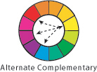
A color and the two colors next to its complement on the color wheel.
|
||
|
|
Two sets of complementary colours that appear in a rectangle on the wheel. These almost always need to be varied in some way - the pure hues tend to compete.
|
||
 |
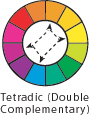
A four-hue scheme that adds a complement of one hue to a triad.
|

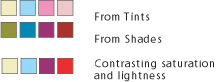
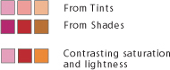
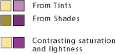
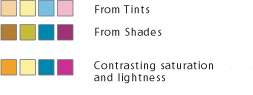
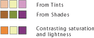
Variations on pure-hue colour schemes
|
|
|
|
|
|

When to use a colour scheme
A monochromatic color scheme puts the focus
on the content. It is clean and classic, and can let full colour photographs
shine. These schemes are often appropriate for serious business and
political projects; they can instill customer confidence in experience.
An analogous color scheme lends a very harmonious feel to a project that is balanced visually. Choose a predominant colour to establish a base, and use the others as accents to maintain the soothing appearance. Nature is full of analogous themes such as blue-green oceans to red-brown timbers. These schemes can represent a project or client as solid, hardworking, earthy, resourceful.
The contrasting Triadic colour schemes are harmonious but lively. Unique, quirky, satirical, exciting. Try de-saturating the colours a bit to stay unique but look a bit more restrained. When triad colors are used in a color scheme, they present a tension to the viewer, because all three colors contrast.
Complementary colours are useful when you want to make the colors stand out more vibrantly. If you are composing a picture of lemons, using a blue background will make the lemons stand out more.
Warm vs. Cool
 Warm
colors are made up of the red hues, such as red, orange, and yellow.
They lend a sense of warmth, comfort, and energy to the color selection.
They also produce a visual result that causes these colors to appear
to move toward the viewer, and to stand out from the page.
Warm
colors are made up of the red hues, such as red, orange, and yellow.
They lend a sense of warmth, comfort, and energy to the color selection.
They also produce a visual result that causes these colors to appear
to move toward the viewer, and to stand out from the page.
 Cool
colors come from the blue hues, such as blue, cyan, and green. These
colors will stabilize and cool the color scheme. They will also appear
to recede from the viewer, so they are good to use for page backgrounds.
Cool
colors come from the blue hues, such as blue, cyan, and green. These
colors will stabilize and cool the color scheme. They will also appear
to recede from the viewer, so they are good to use for page backgrounds.
Other ways to choose colours:
|
Tone Colour Scheme: A tone colour scheme means combining colours together that belong under the same general grouping. In other words, bright colours are combined into a bright colour scheme, and subdued colours are combined into a subdued colour scheme. Because the colour scheme is based on related colours, the overall scheme appears balanced; the key is to arrange the tones as perfectly as possible. |
|
|
Gradation Colour Scheme: This is created when colours are arrayed in order according to their hue, lightness, or saturation; ie, sequential. These schemes stand out even when calm tones are used. Especially effective are hue and lightness (value) gradations. A rainbow is a kind of gradation, so are monochromatic schemes. |

|
Separation Colour Scheme: When two colours look unclear because their colour values are similar, or when the harshness of colours opposite in hue should be toned down, use this technique. When a neutral colour is placed between two colours which don’t really complement each other, it assumes the role of a connector, and so the entire scheme is arranged well. Neutral colours here are usually white and black – most effective and clean. Next is gray; sometimes beige works. Gold and silver can also work. |

|
One-Point Colour Scheme: This is also called accent colouring. Concerned with contrasts, its effect derives from the division of the surface area into large and small regions with an opposing colour set into the smaller area. The aim is to balance the whole scheme. For hue contrast and lightness contrast, either of the opposite colours can be used as the ground, but for saturation contrast, the schemes look better composed if a subdued colour is used as the ground (background) and a vivid colour as the point (accent). This gives priority to shape, so it is essential to calculate the shapes beforehand. |
